Every time you go to a store, there are many promotional displays to convince you to buy more. Client ‘Alpha’* has a huge team devoted to building the best brand experience and selling more in stores. I worked with this team to combine two existing apps and add new workflows to create a one-stop app. As the sole designer, I conducted research, managed timelines, created all patterns and visuals, developed workflows, and advocated for good UX design.
Here is an example of one completely new feature for the app which is currently helping users across the US and Canada manage and plan better displays.
*Please note – some minor designs formats and names have been changed as part of the NDA.
At first the requirement was to have reps input a bunch of information and provide a count of displays per store. However, as I dug in I found the root problem is that the promotion team didn’t directly know how each display is doing and needed more information to improve displays.
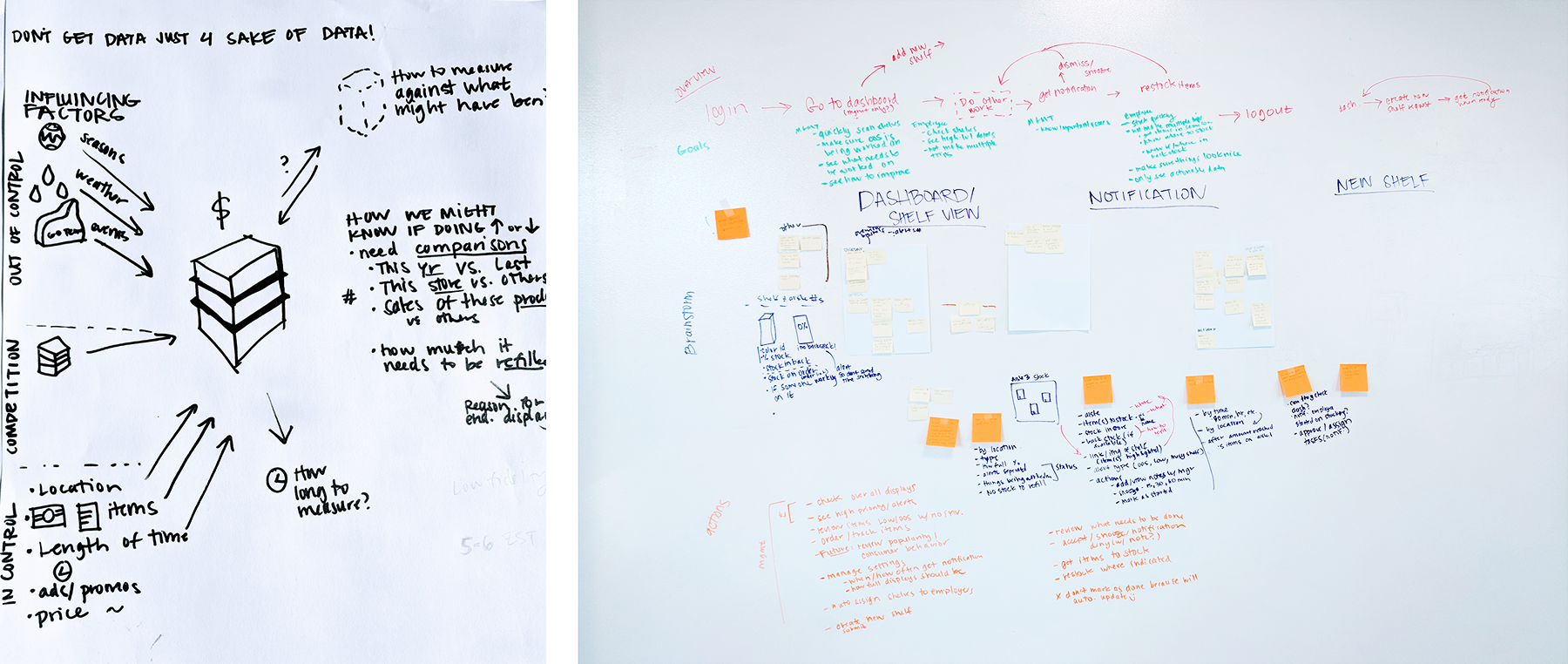
I observed that reps walk around the store and manage displays be section. I also worked with the business team to narrow down details recorded from 15 to the 7 most helpful. All details selected are important for identifying unique displays and planning promotions.
I collaborated with the dev team early and throughout the process to go over feasibility, reduce development time, and brainstorm ways to improve the experience and interactions. I also iterated through requirements, workflow, and UI multiple times with the product team.
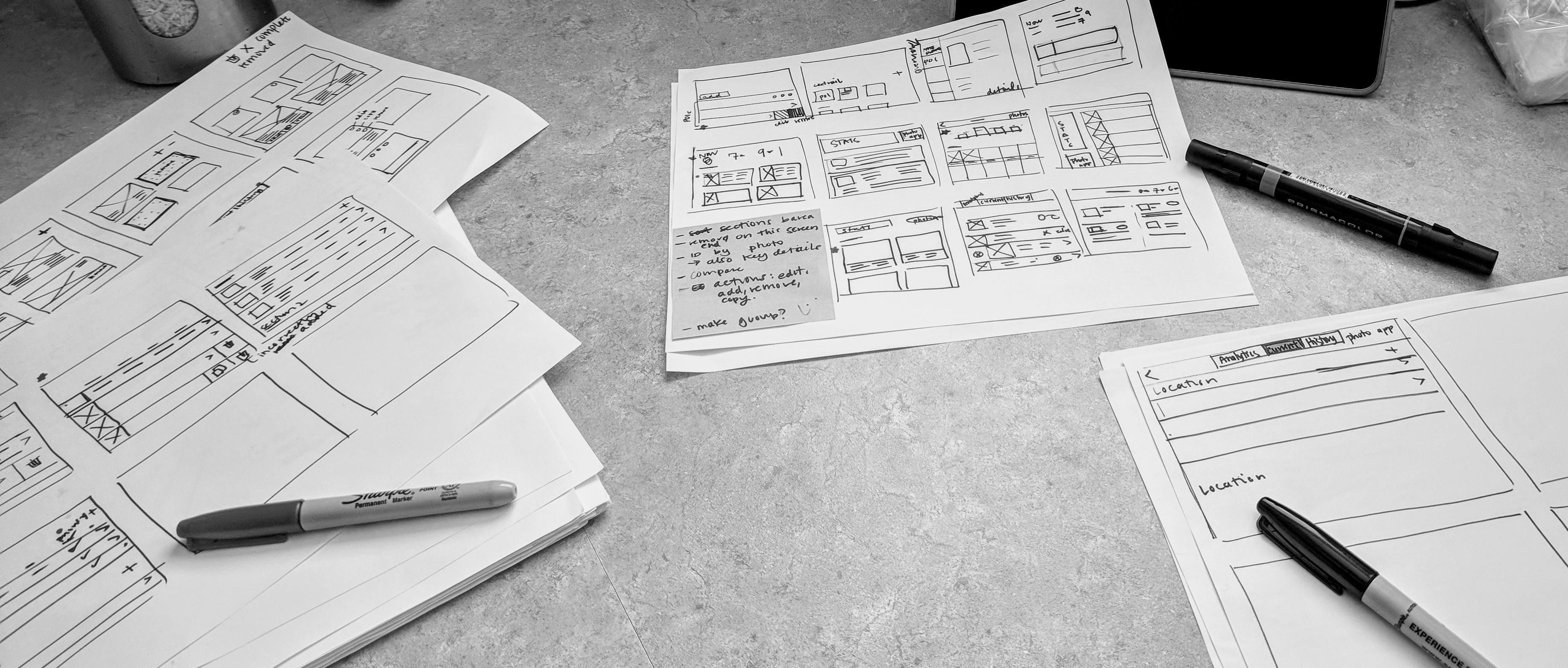
For the display management feature to be effective, I knew I needed to test if the layout felt intuitive which I tested with an InVision prototype. I also wanted the interactions to feel fluid and clear which is why I tested it in Framer.
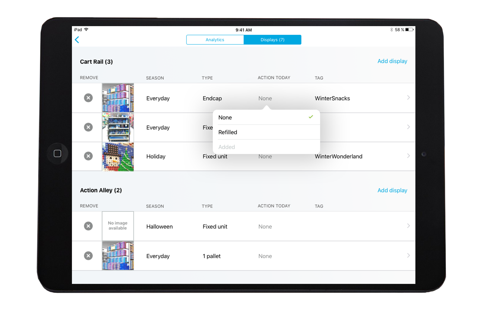
I saw reps walking section to manage their displays so I created the display manager to line up with their mental model. Displays are grouped by location and can be dragged between areas just as they are physically moved in stores. Displays are in rows to show more displays at once and make it easy to compare content.
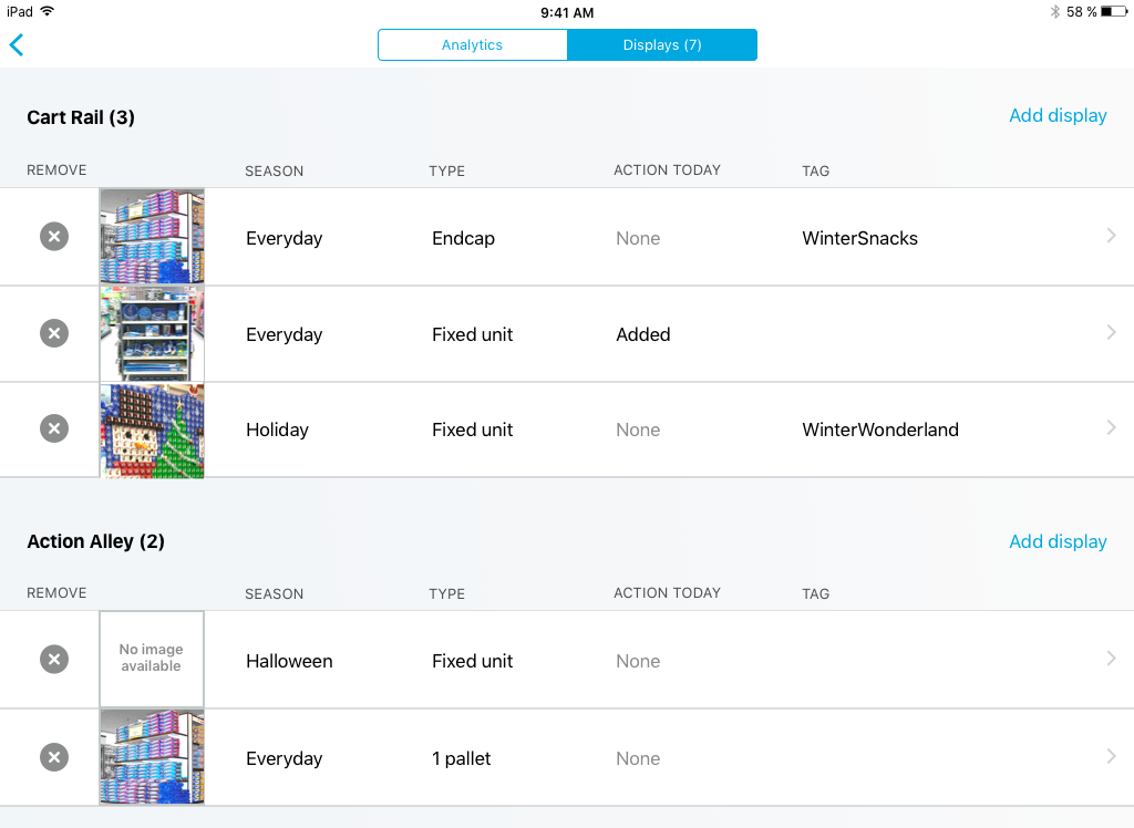
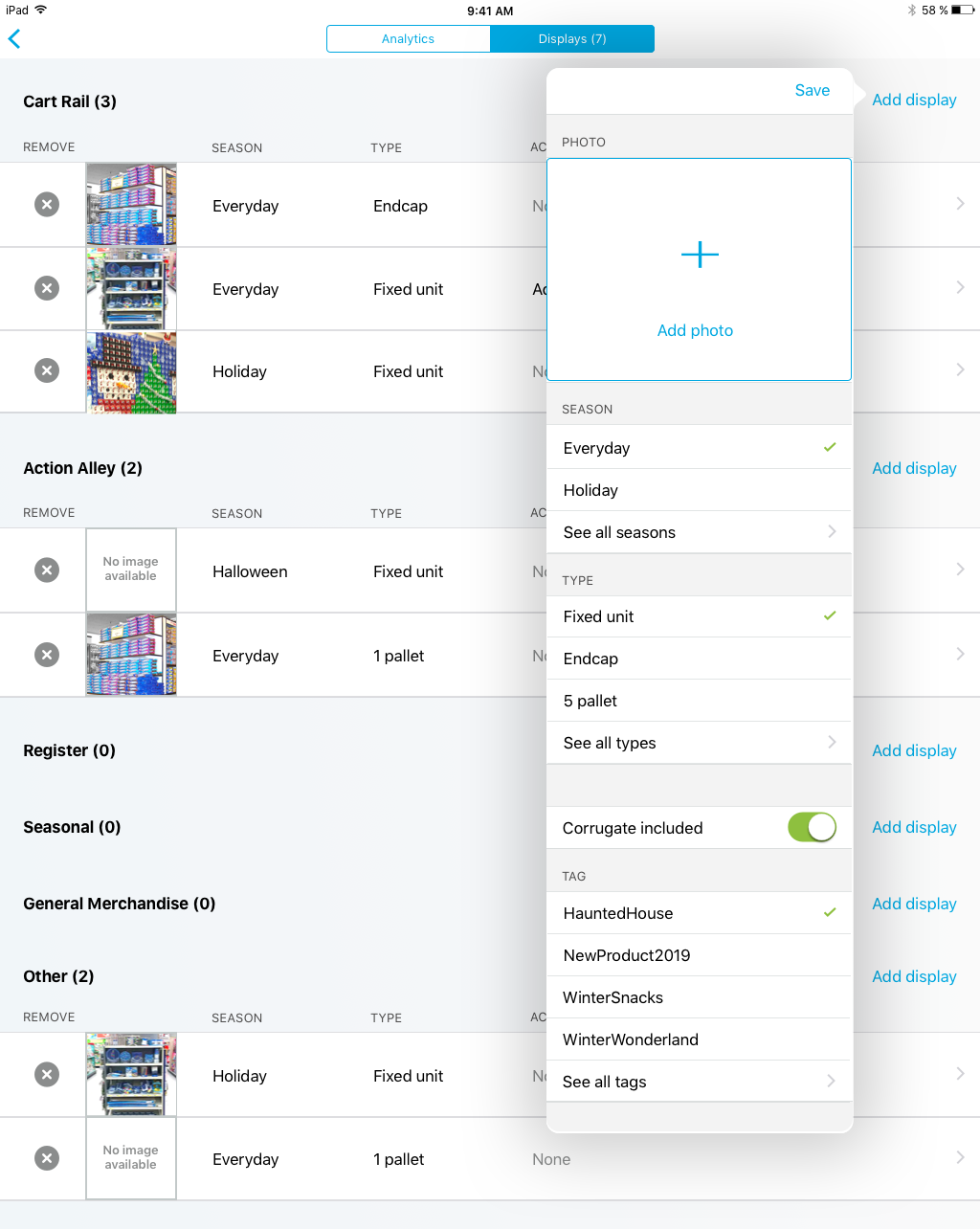
Reps were worried about the amount of time to add displays, so I greatly simplified what they need to add. I only included the most helpful data, designed it so location and date are automatically added, and selected smart defaults. To keep the popover short, the most plausible options are surfaced based on date ranges, frequency, and recency.
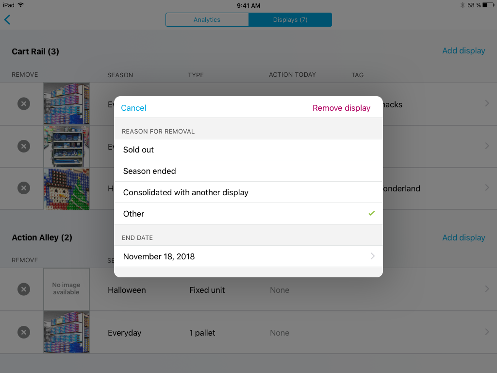
In testing I foud that add and edit needed to be approached differently to keep it simple. Users can quickly edit items by tapping a detail on the main page or tap the arrow to see all details. Reps usually only edited 1-2 things at a time so an overview list is shown to reduce scrolling.
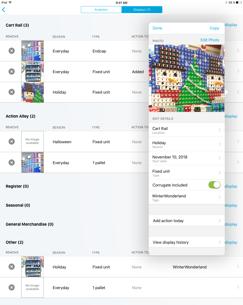
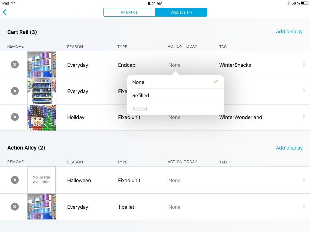
Gathering data about display performance is tricky to get from sales data, but reps can get a feel by how often a display needs to be refilled. I came up with two easy ways for the rep to track this important metric.
Currently the application is working well to gather data to be communicated between individuals and the promotion team. I would also like to create a way for individual reps to better collaborate with one another. Ideas include sharing photos of cool displays they’ve built and being able to mark the performance of displays.
I would also like to prototype creating lists of items to grab quickly from the display list. This would be a more direct way to help reps manage their workload and save trips around the store.


Hand-coded in HTML & CSS