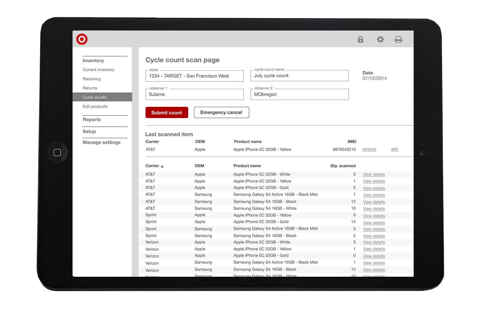

Target reps had a tool to help them manage their device inventory and check if items were in stock for customers. I saw an opportunity to improve it, conducted research, and convinced the department VP to implement my redesign. Because of my redesign, Target saw a decreased error rate of mobile inventory in nearly 2,000 Target stores and estimated a savings of 36,000 labor hours a year.
One of Target's inventory management applications had grown organically and had become difficult to use. Since these tools are used across thousands of stores, even a small increase in efficiency can have a large impact.
As a self-directed project, my goal was to match the mental models of users in order to decrease labor costs and increase user happiness.
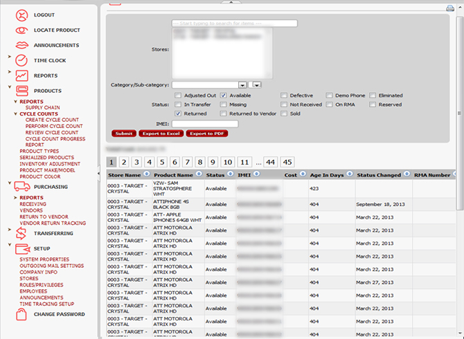
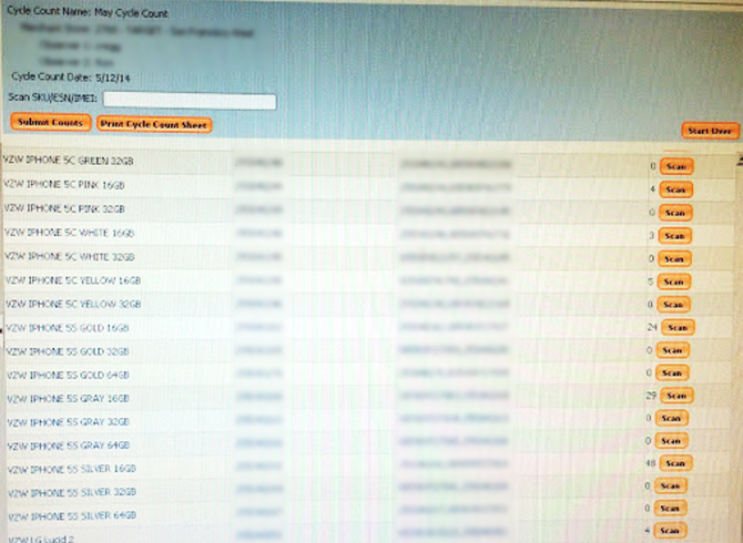
To improve the speed and accuracy of the tool, I met with several users at Target stores to watch how they used the tool to complete their tasks. I noted their goals, frustrations, and “hacks” they used to get the job done.
I also worked with business and operation teams to understand their needs and aims. I worked with the development team to identify how changes could impact other processes and revised the design accordingly.

After analyzing the strengths and opportunities of the current tools I created a flow diagram to match users' processes. I eliminated several clicks, which shaved minutes off of the monthly inventory process and seconds off daily tasks.
I also streamlined the process so users could more efficiently toggle between tasks.

I did a content evaluation of the inventory screens to consolidate and remove excess information that had grown over time. I also worked with the product team to write clearer names for menu items and buttons.
I leveraged the existing structure to save developer time, and used hierarchy and layouts based on user research to simplify the effort needed. I cleaned it up to give confidence that the tool was performing correctly and set up defaults to optimize the most common tasks.
