The UW Research Commons (RC) is a library designed to help foster collaboration in an energetic atmosphere, but they thought the site could better reflect their mission. I worked with a team of five to re-work the information architecture and come up with a clean new design to capture the library’s character.
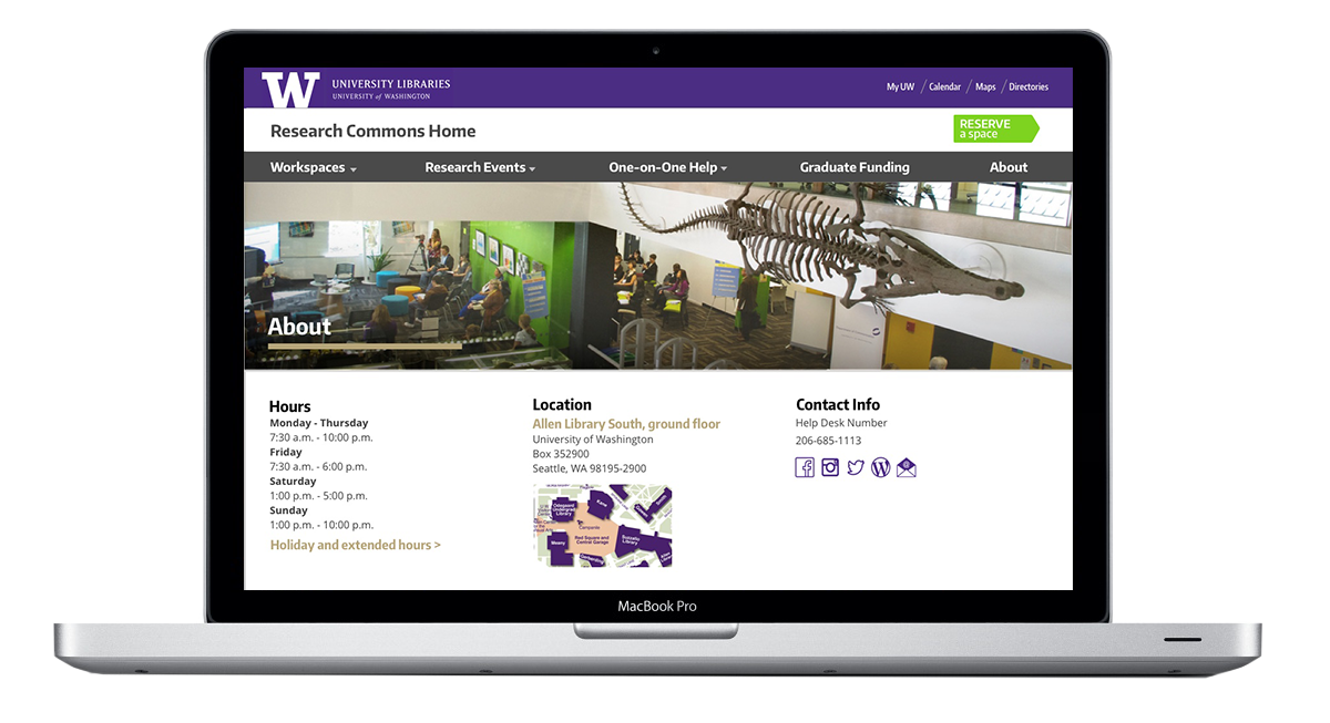
During usability testing, the Research Commons found that students had a hard time finding the key areas of the site. They also manage a wide range of helpful student activities which were getting lost in the site from research events, to writing tutors, to graduate funding.
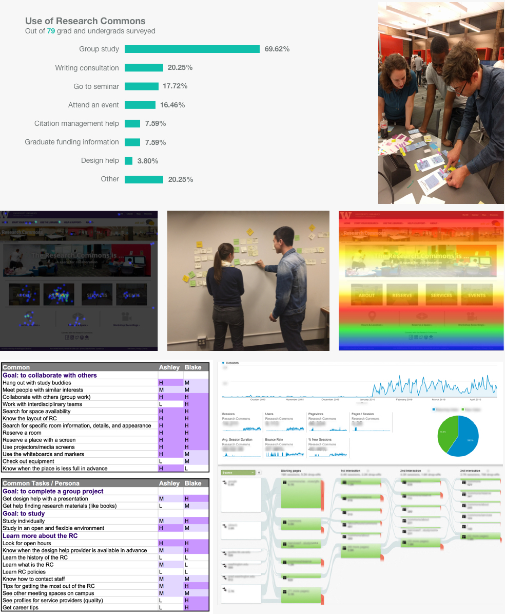
I conducted research and worked with our team to understand how students currently use the site and what they would like to accomplish.
Usability tests revealed that UW students did not know much about the library and struggled to navigate the site. This was summarized by one of the Help Desk attendants: “There are lots of cool events, but people don’t know about them.” Doing well in school & working quickly were most students' end goals of using the library, with around 70% surveyed using the RC for group work.
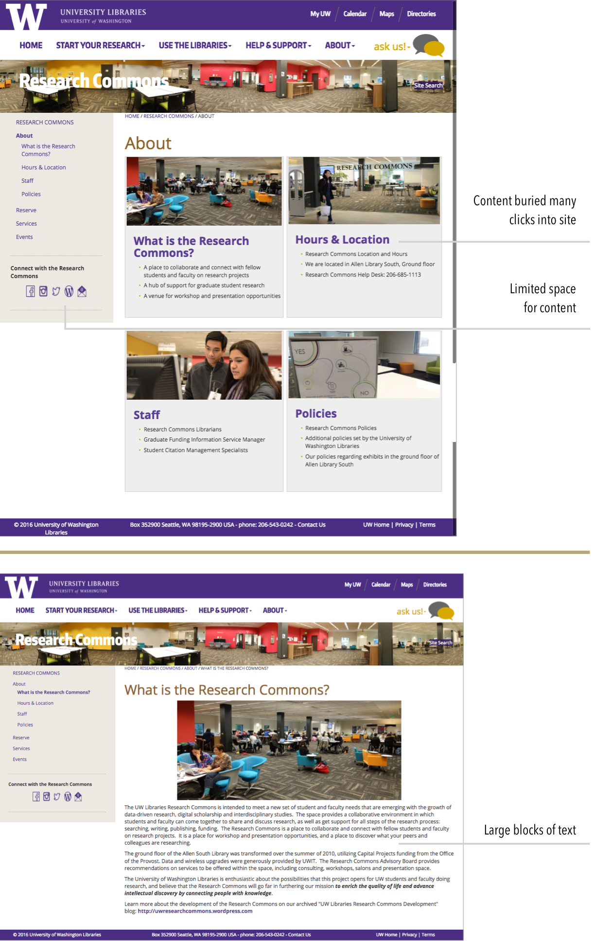
We found organizing the IA challenging because of so many great but unrelated services. The site required many clicks, and even experienced users had a difficult time finding things. Based on our findings, we split up research collaboration and personalized help, and gave graduate funding and events a bigger voice.
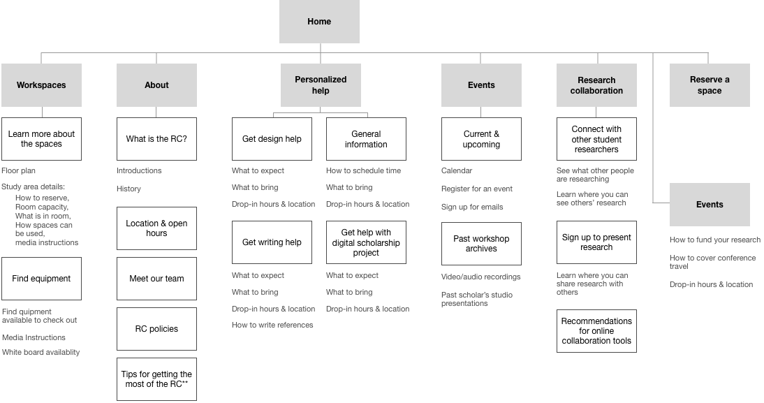
A clear navigation is important to accomplish the RC’s goals, so we tested 9 prototypes with students to get it just right.
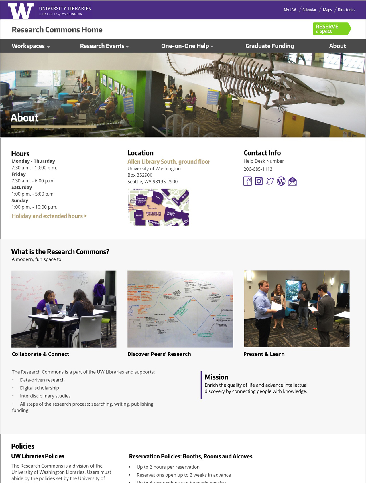
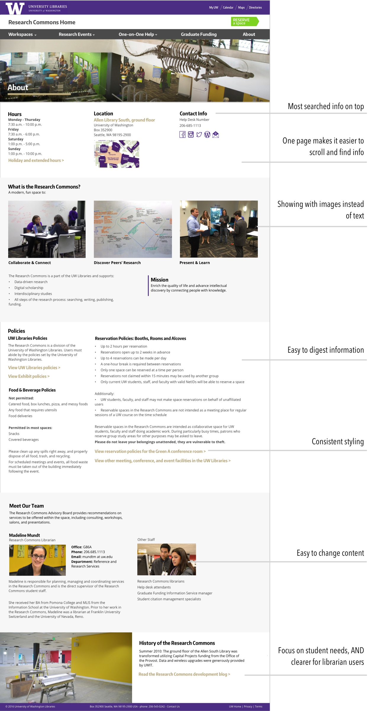
In our research, we found users more likely to scroll than click so moved all the about information to one page instead of across five. I also re-wrote all the copy to be more student friendly.
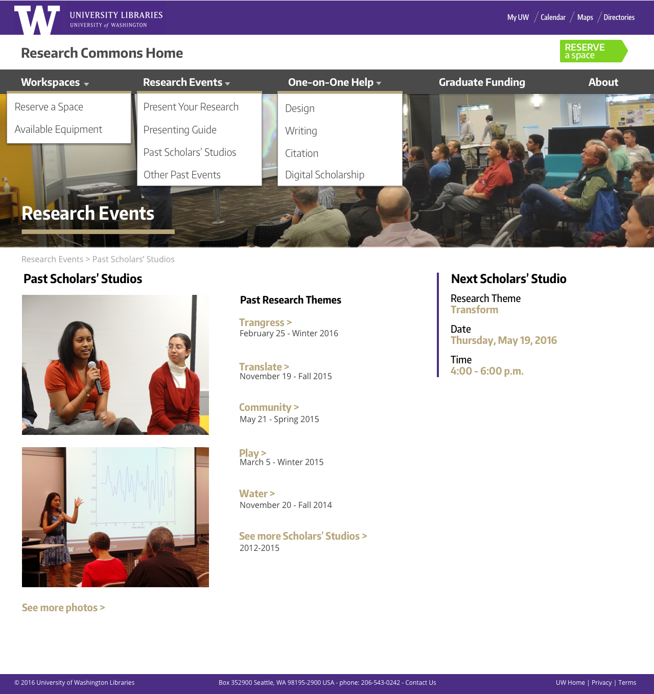
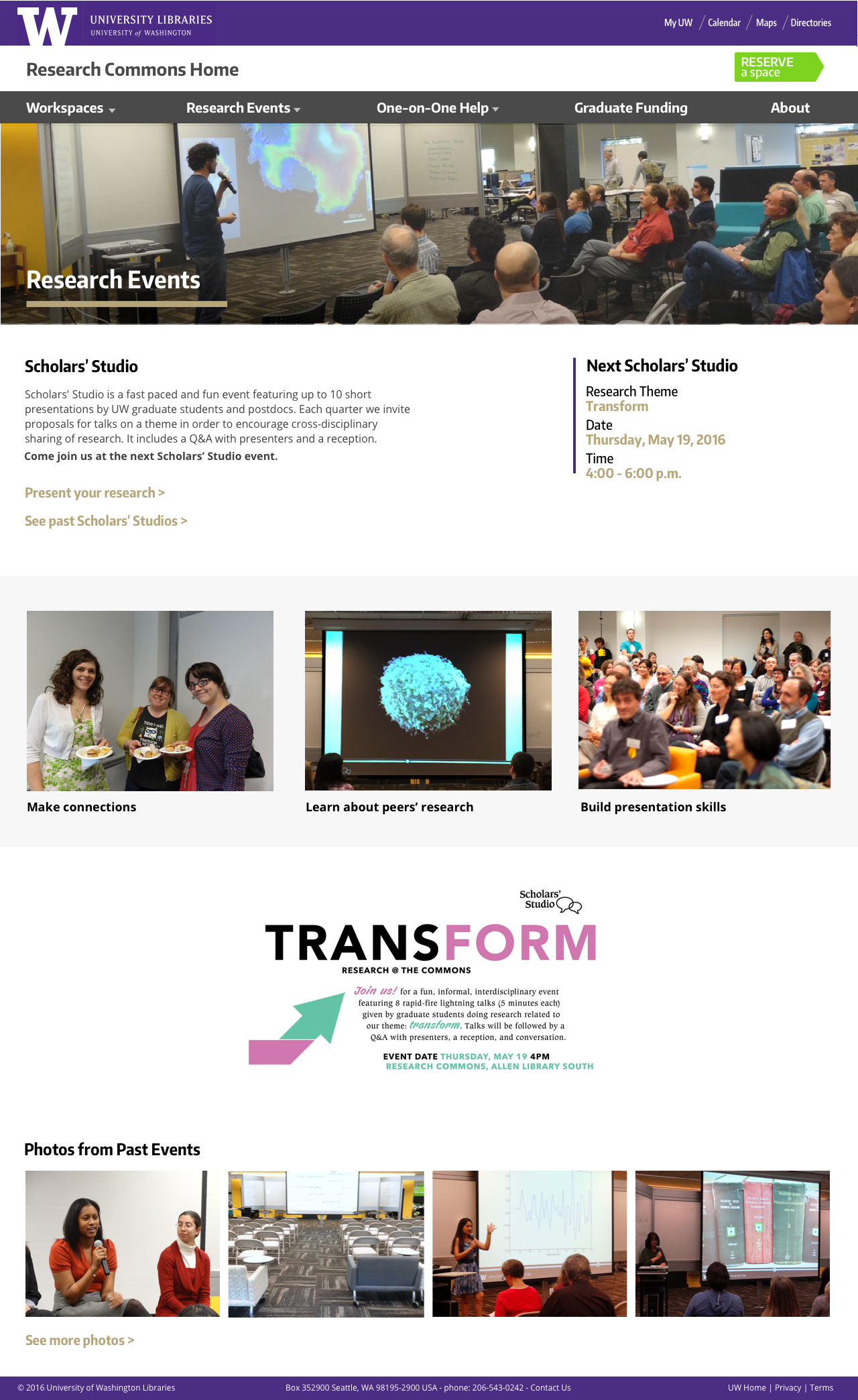
I cleaned up the workflow for the research events and surfaced it in the navigation to increase awareness. I also used photos and small bites of copy to show new students all the good things to expect from these events.


Hand-coded in HTML & CSS