
Enterprise iOS App
Empowering Sales Team: Promos
Every time you go to a grocery store, there are many promotional displays to convince you to buy more. I worked with a large CPG company to empower their sales team to better sell, schedule, and manage their work. Our team merged and streamlined their workflows in one portable tablet app. As the sole designer, I led the UX portion from research, to negotiating features, to final visuals.
One new feature I worked on was an MVP to help the internal team analyze the success of various promotions.
MY ROLE
- UX designer
- Prototyper
- Visual designer
- Client contact (as part of Accenture)
KEY FEATURES
- Quick view of key analytics
- Easy to add, edit, and remove displays
- Tracking display through refills
- Photos to show fun displays
Challenge
The company tracks the total sales of items, but understanding individual promo displays is challenging as all items use the same SKU. Gathering meaningful data would help sales reps and the company plan and execute more profitable promotions.
Goals
- Gather data to help promotion team plan future displays
- Take reps minimal time to manage and get data for displays
Constraints
- Minimal engineering time - so designs need to use standard iOS patterns
- Needs to work on iPad Pro online and offline
- Needs to fit in well with reps' current process
- Fields need to fit dynamic options for different stores and changing needs
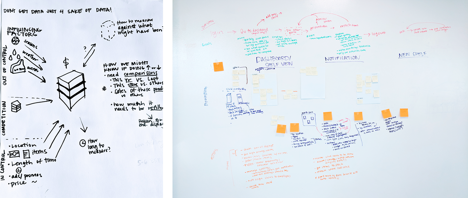
RESEARCH
I observed that reps walk around the store and manage displays by section. I also worked with the business team to narrow down details recorded from 15 to the 7 most helpful. All details selected are important for identifying unique displays and planning promotions.
Methods
- Store ride-alongs with observations and contextual interviews
- Interviews with promotional business team
- Reviewing user requests
- Current workflow analysis
Key Pain Points
- Displays are constantly changing products and moving around stores
- Reps hate adding photos and typing text
- Managing displays sounded tedious and made reps feel more transactional and less empowered to make sales
- Too many display options to choose from
- Outside factors make it hard to determine what is affecting displays
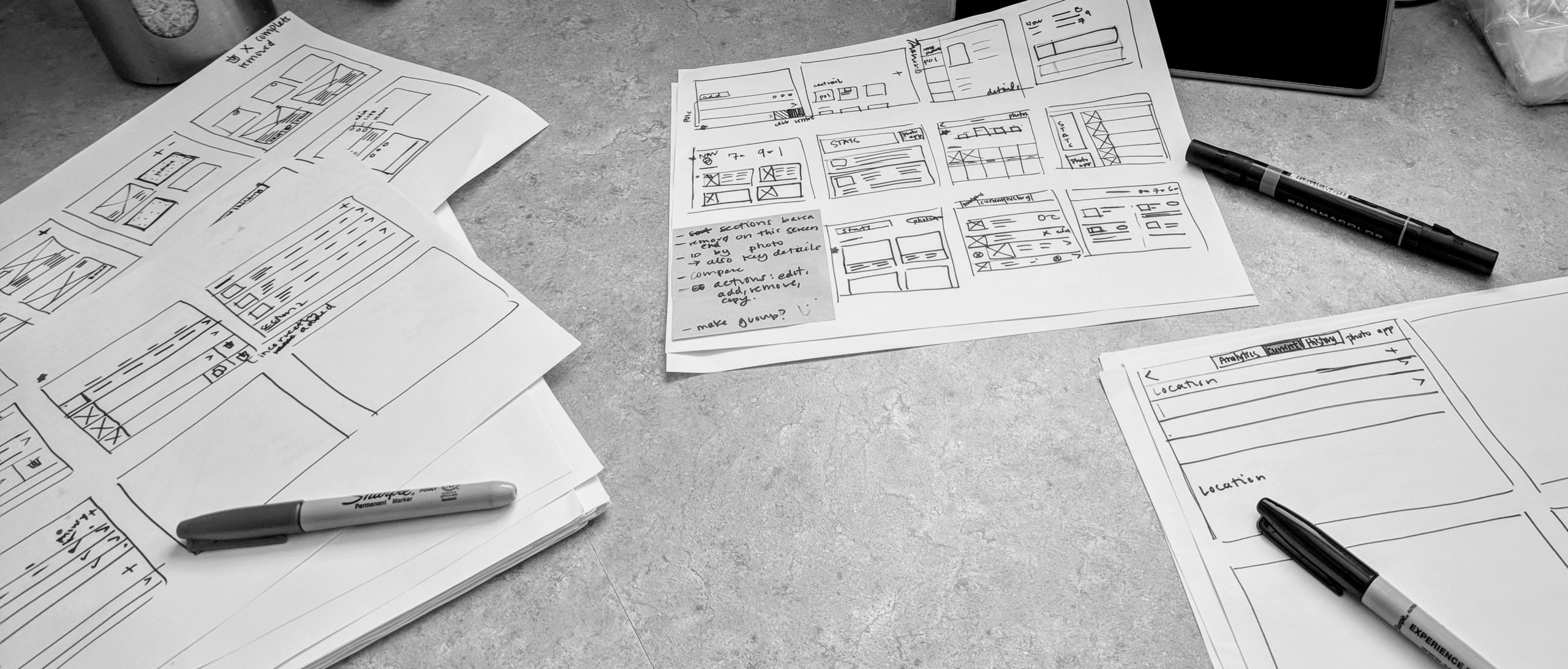
PROTOTYPING & IDEATION
I collaborated with the dev team early and throughout the process to go over feasibility, reduce development time, and brainstorm ways to improve the experience and interactions. I also iterated through requirements, workflow, and UI multiple times with the product team.
I knew I needed to test if the layout felt intuitive and non-intrusive as sales reps are reviewing and building displays while juggling their tablet. I found that:
- Adding pictures should be optional
- Details on the main page need to (1) differentiate displays that might not have images (2) provide quick access to frequently changed details
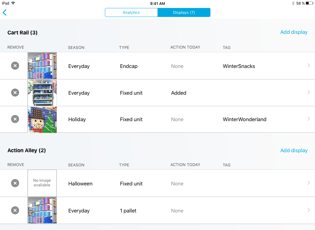
SOLUTION - MANAGING DISPLAYS BY CONTEXT
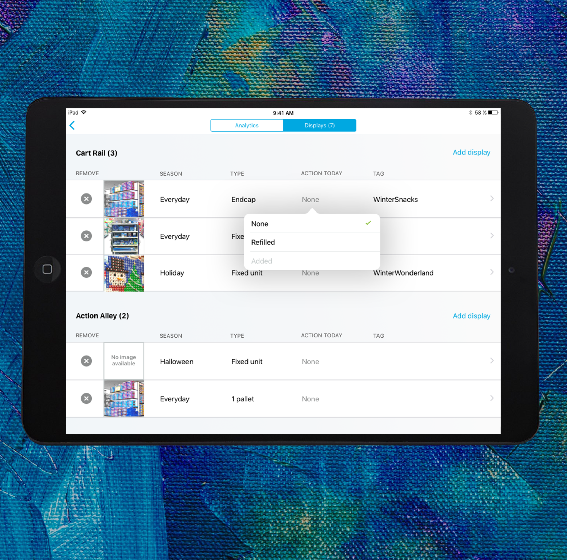
I saw reps walking section to manage their displays so I created the display manager to line up with their mental model. Displays are grouped by location and can be dragged between areas just as they are physically moved in stores. Displays are in rows to show more displays at once and make it easy to compare content.
KEY BENEFITS
- Follows users’ mental model and process
- Saves selecting location when adding a new display
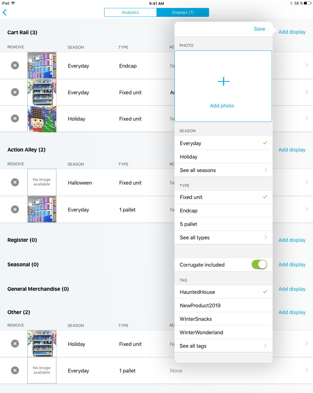
SOLUTION - MINIMAL EFFORT TO ADD
Reps were worried about the amount of time to add displays, so I worked with key stakeholders to simplify required and optional fields. I prioritized data and added smart defaults such as automatic location and date. To keep the popover short, the most plausible options are surfaced based on date ranges, frequency, and recency.
KEY BENEFITS
- Quick overview and minimized scrolling to view details
- Long lists of options are kept organized
- Large photo space encourages adding a photo
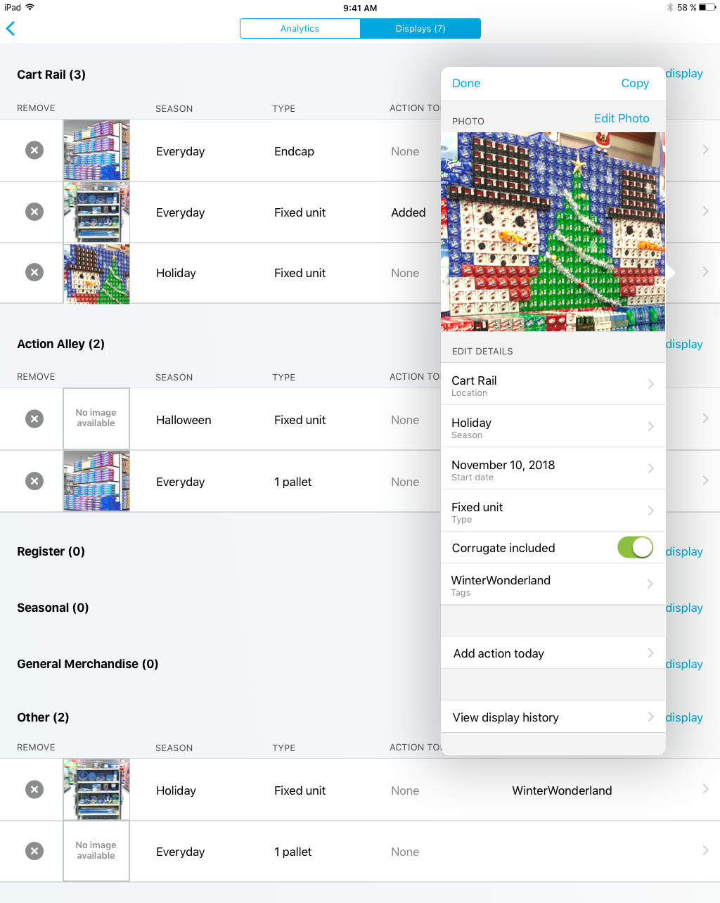
SOLUTION - EASY TO EDIT
In testing I foud that add and edit needed to be approached differently to keep it simple. Users can quickly edit items by tapping a detail on the main page or tap the arrow to see all details. Reps usually only edited 1-2 things at a time so an overview list is shown to reduce scrolling.
KEY BENEFITS
- Quick overview and minimized scrolling to view details
- Long lists of options are kept organized
- Large photo space encourages adding a photo
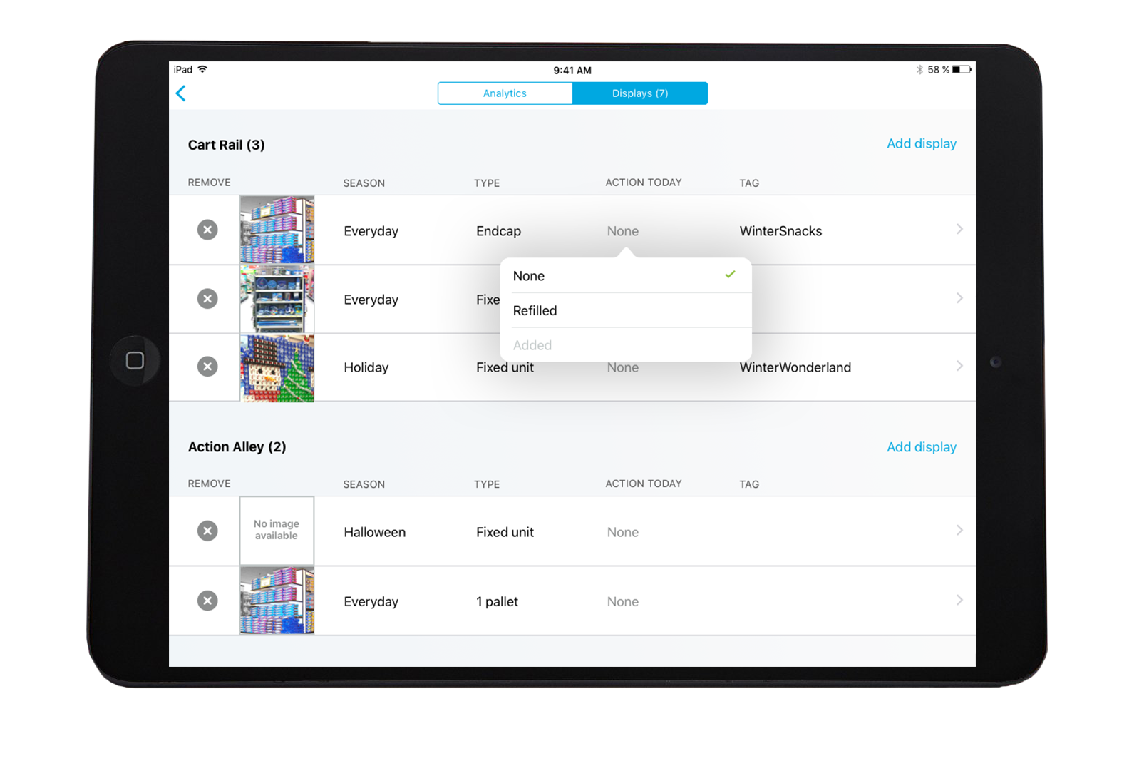
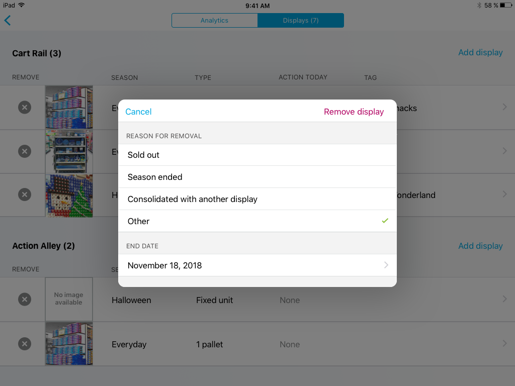
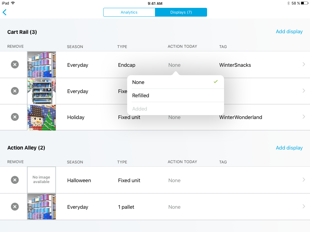
SOLUTION - GATHER MORE PERFORMANCE DATA
I had a hypothesis that a way to measure display success is by how often it needs to be refilled. I came up with two easy ways for the rep to track this important metric.
KEY BENEFITS
- Get data about refill rates and popularity of display
- Doesn’t require free text
- Occurs in natural workflow for users
Results
- Launched this new sales app to teams in 88,000 stores internationally
- For this display tracking feature internal teams received 7 new key data points, and we did not see a significant increase in sales rep time in app
- My contract was extended 4 times with the team
Reflection
Currently the application is working well to gather data to be communicated between individuals and the promotion team, and I see lots of potential for individual reps to better collaborate with each other. Ideas include sharing photos of cool displays they’ve built and being able to mark the performance of displays.
I also see opportunities to make it even easier via quick actions since reps do common actions like refill and move many times per day.
Selected Works
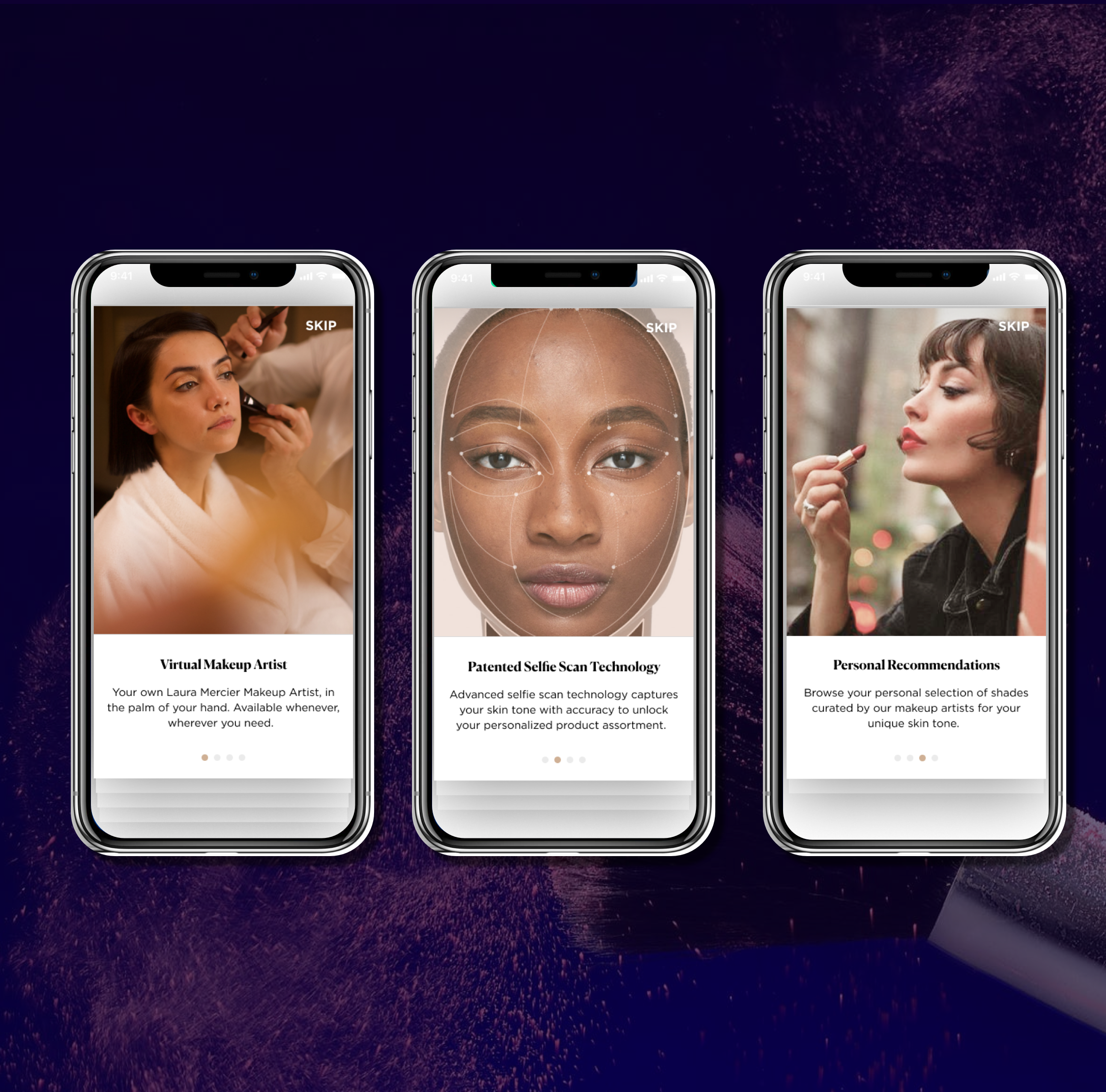
My Digital Makeup ArtistiOS + Android App
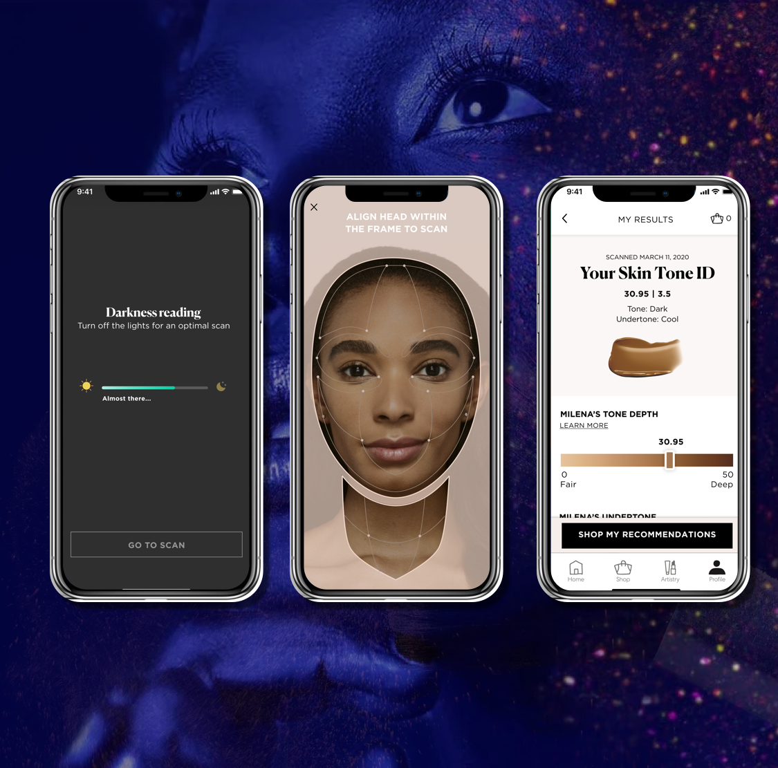
Selfie ScaniOS + Machine Learning

Profile for PersonalizationAmazon App

Onboarding New VR UsersVirtual Reality
Empowering Sales TeamiPad app